This study is to find how different layout can effect the performance of product landing page. This study begins with researching on what aspects and functions the users would like on their online shop. After implementing the functionality the users are asking for, the purpose of this landing page is to funnel customers into the call to action and increase sales of the product. I have included a mock prototype here.
Introduction:
It is troublesome when it comes to purchasing foreign CDs especially when the website does not support your language. You can be overwhelmed with the information on the site and it is difficult to navigate to the product purchasing page. Resulting the loss of a purchase from potential customers.
How can we create a modern and efficient product landing page for customers and minimialize the possibility of turning customers away?
Research & Assumption
We had conducted online surveys on platforms such as Discord and reddit to get a grasp on the struggles foreign fans have when navigating websites in foreign pages.
Value Proposition. How is this valuable?
Increase Brand Awareness. Having a brand representation in other languages allow for customers from different countries to understand the company behind the product.
Drives Sales. A product page that is negative to navigate can often turn away customers. By having a successful product page can increase sales numbers.
Saves time. Customers can easily access the item they want compared to having to search through multiple outlets to find the items they need.
Where? and When is this product used?
Oversea customers can buy their desired products through an official channel online.
Oversea customers can easily share their desirable goods to friends.
Companies are able to increase amount of sales.
Companies can increase their oversea market.
Ideation
Ethnography Observations. How previous system worked
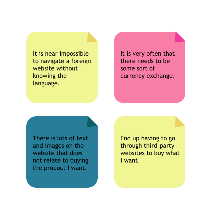
From our research, we find the following,
People often turn away from purchasing when there needs to be a currency exchange.
The lack of language support options make understanding the return policy and the information about the product near impossible.
Using Google Translate on the webpage can sometimes make the website understandable but is often unreliable.
Using third party sites often result in slower delivery time as well as an additional fee onto the original product.
Problems to Tackle.
Providing an English option.
Streamline steps to purchase to avoid customers leaving due to UI design.
Create visuals that can get customers interested in the product.
Solution
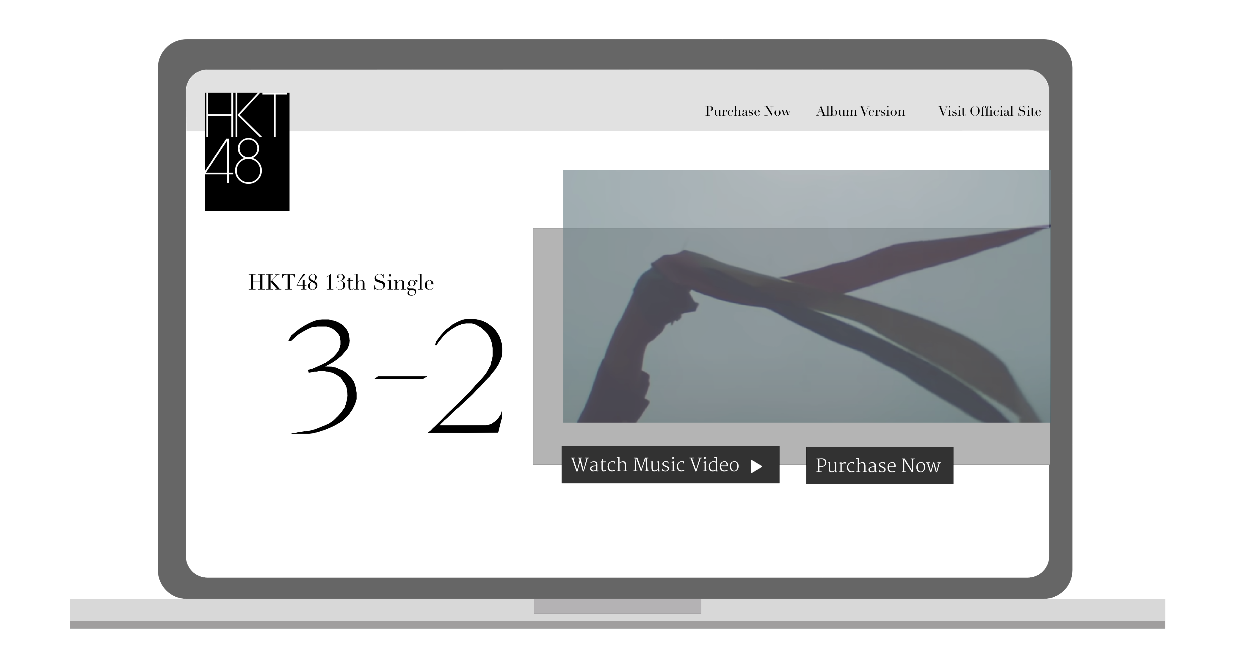
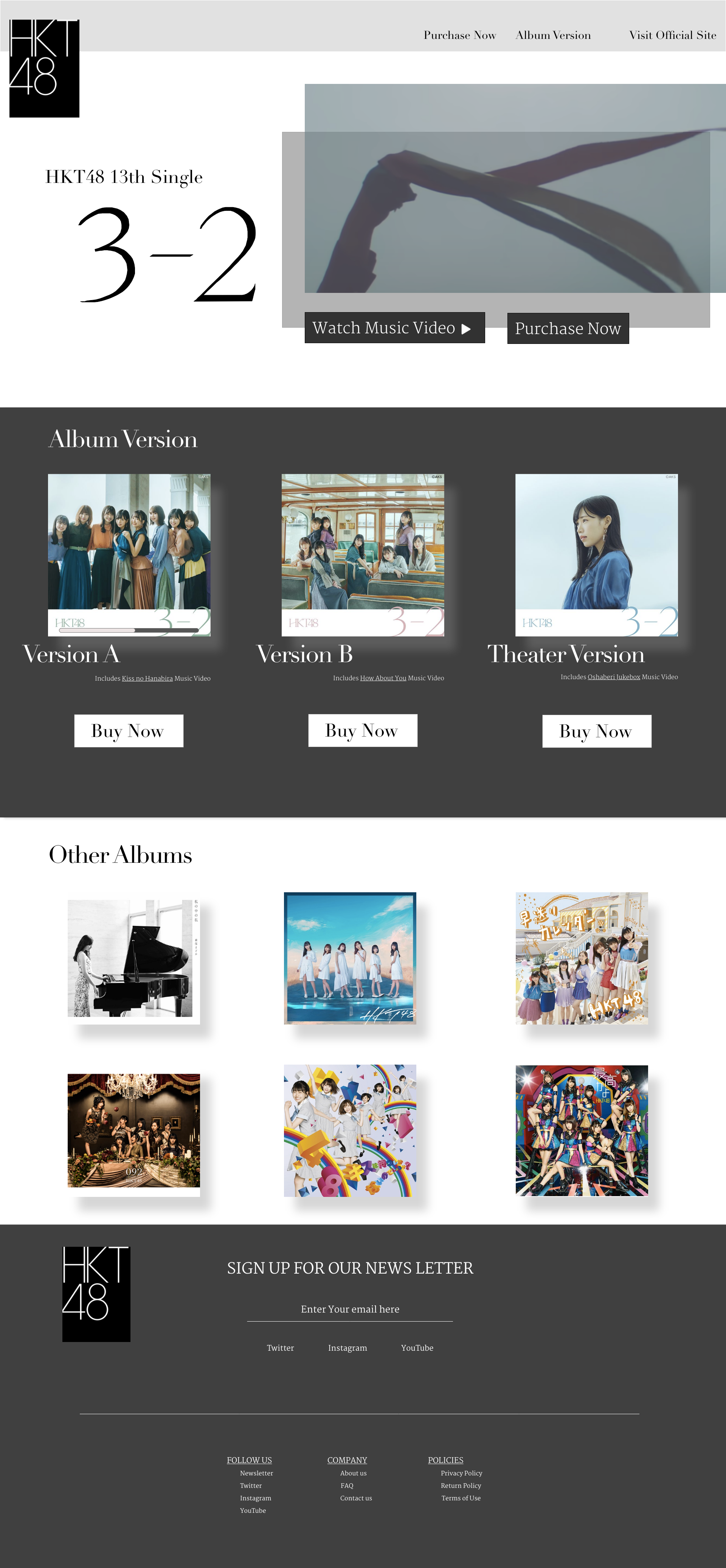
We created a landing page specifically focusing on the release of the latest album. We keep in mind to include the call-to-action in multiple areas to bring traffic into the purchasing page. We include the price tag according to the region the customer is in.
The landing page introduces the artist and product name and the music video of the title song of the album to draw attention.
Call-to-Action is included on the top navigation bar where customers can easily access when they decide to purchase.
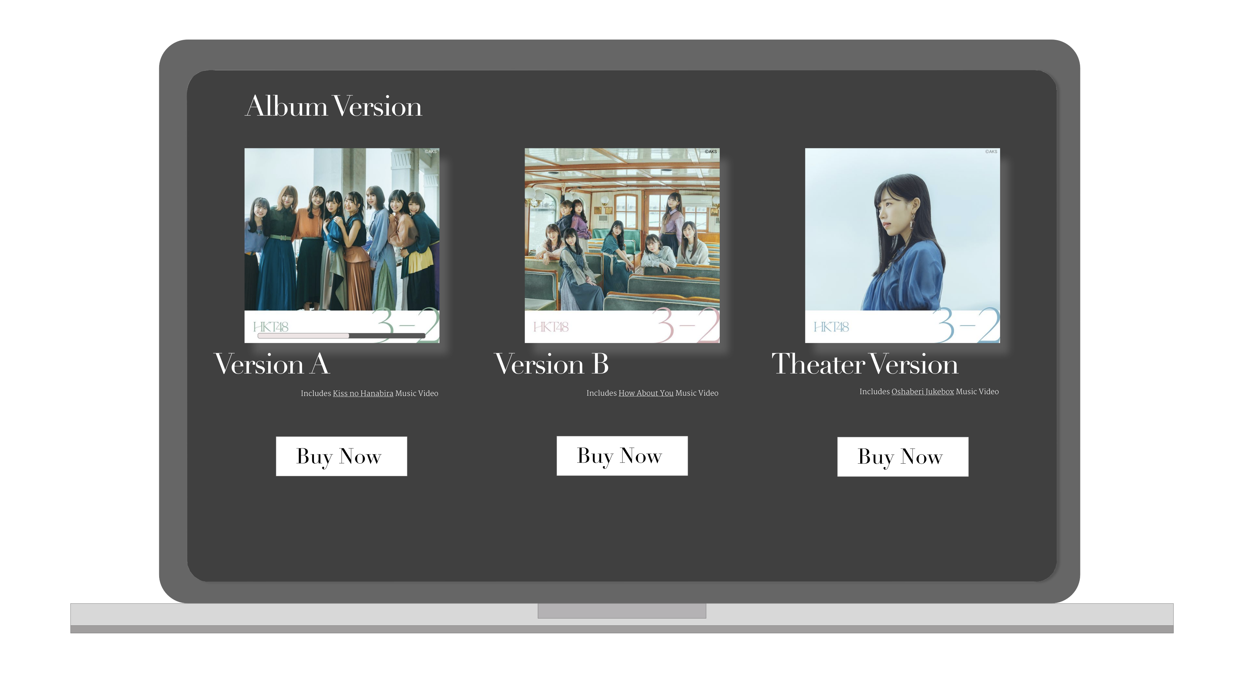
Reduces Clutter for the Product
Users can select the version of the product they would like to purchase. There is a small description on the difference between the products. Other informations is omitted to reduce clutter.
There's a call-to-action beneth each variation of the product in hopes of driving traffic into the purchase page.
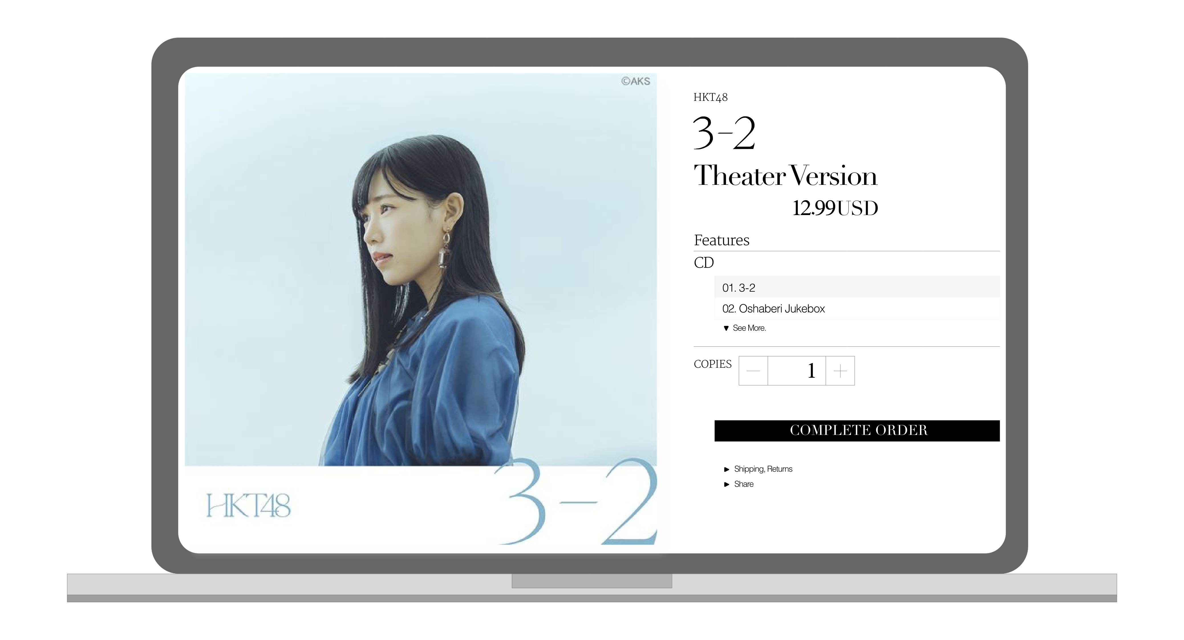
Call-to-Action
Customers have the option to review the details of the product on the purchasing page.
Price of the product is adjusted to display the currency the region the customers is in.
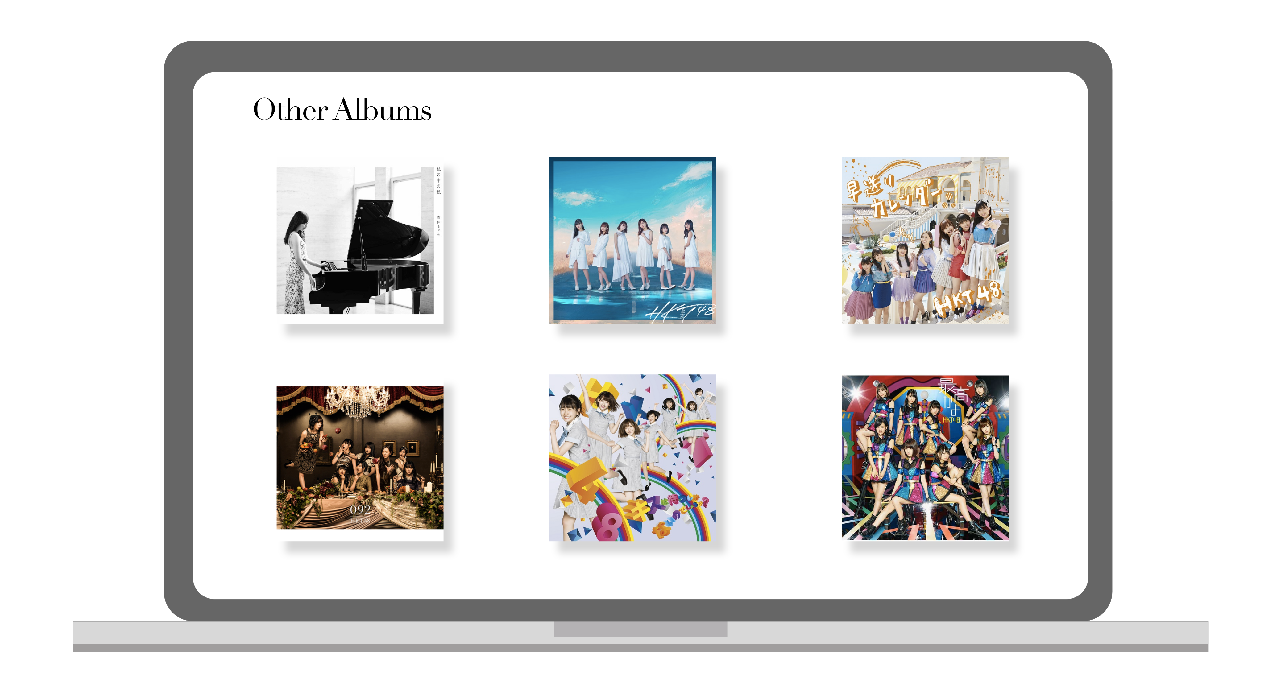
Advertising for Similar Products
Users are provided with more option of similar items when the product they are viewing does not meet what they want.
Product Mockup
Reflection
It is important to include the call-to-action in nearly all possible location of the web page in order to drive customers into pursuing the goal of the web page.
Including a footer section is a great way to provide additional information of the company even if the customers are not interested in this particular product.
Conclusion
Call-to-Action is the most important aspect of a landing page.
Enable customers to achieve what they want to do by reducing the hurdles, such as language barrier and unfriendly UI design.
A product landing page's success depends on how easily cusomters can perform their task. It is important to simplify the website to avoid customers from getting distrated from their goal.
By building upon this landing page design, I think it is possible to include different variety of items and expand this landing page into a e-commerce store.